Seoul Etched into a European Sensibility: NOHANT
An analysis of NOHANT's brand identity and its global retail competitiveness, 14 years in.
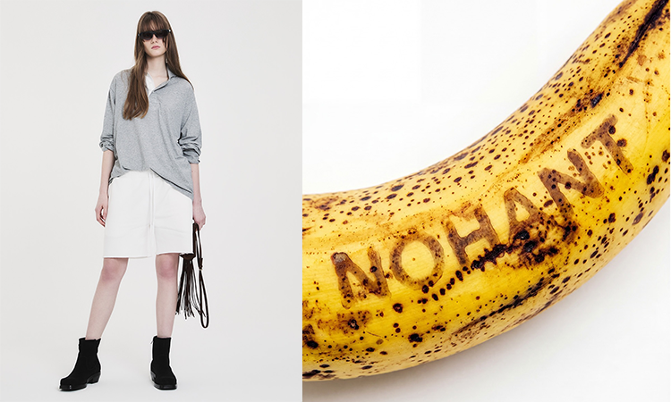
Launched in 2012, NOHANT has built its own style around the "Brunch Look," inspired by the natural elegance of Parisians. Modern, simple designs rooted in the classics, along with unisex silhouettes that both men and women can wear every day, are the brand's starting point.
What's interesting is that while pursuing a European sensibility, the brand has actively used the language of Seoul and Korea, where it began, as a design asset. From city graphics that combine Hangul and English to witty typography, its way of combining familiar elements in unfamiliar ways has become a key design language that defines NOHANT.
We look at the core identity of NOHANT, which has carried on for 14 years since its 2012 launch, and the competitive strengths worth noting from a retail perspective.
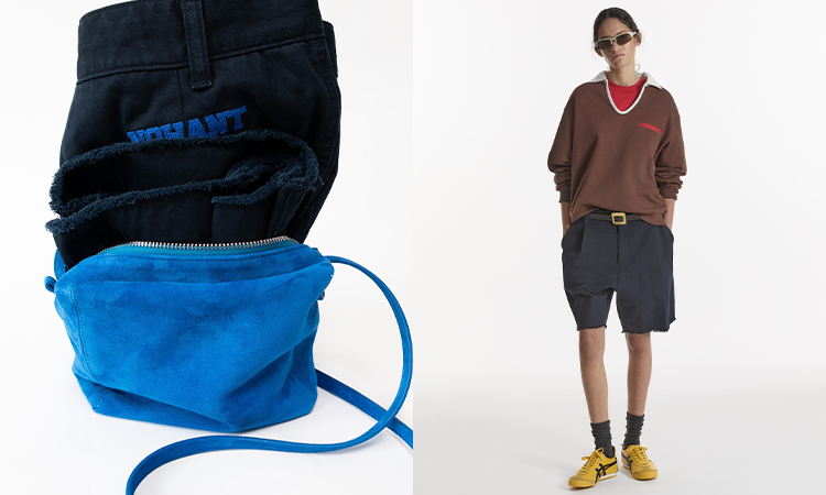
How the Brand Began
The name NOHANT came from the French pronunciation of designer Noah Nam's name. The core concept the brand officially describes is the "Brunch Look," meaning it aims to translate Parisian modernity, simplicity, and relaxed elegance into everyday wear.
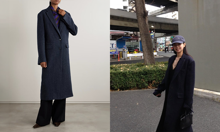
Tailoring Rooted in the Classics
At the center of the design NOHANT has maintained over the years are the classics.
It reworks traditional items like trench coats and jackets with relaxed silhouettes, proposing them in forms that are easy to wear in everyday life. Naturally connecting casual items and tailoring within a single collection is another hallmark of NOHANT.
Rather than drastically changing its silhouettes with each trend, it consistently carries on the modern, relaxed mood the brand has always pursued, which offers a view into its long-term product assortment.
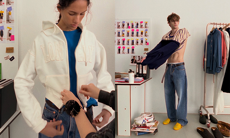
Unisex Fit
Since its early days, NOHANT has made unisex ready-to-wear the core of the brand.
Its collections are built around relaxed fits that both men and women can wear comfortably, allowing a single product to be proposed to a wide range of customers.
For buyers, too, rather than clearly dividing product categories by gender, a single style can be offered to multiple customer groups, which has the advantage of allowing more flexible inventory and store setup.
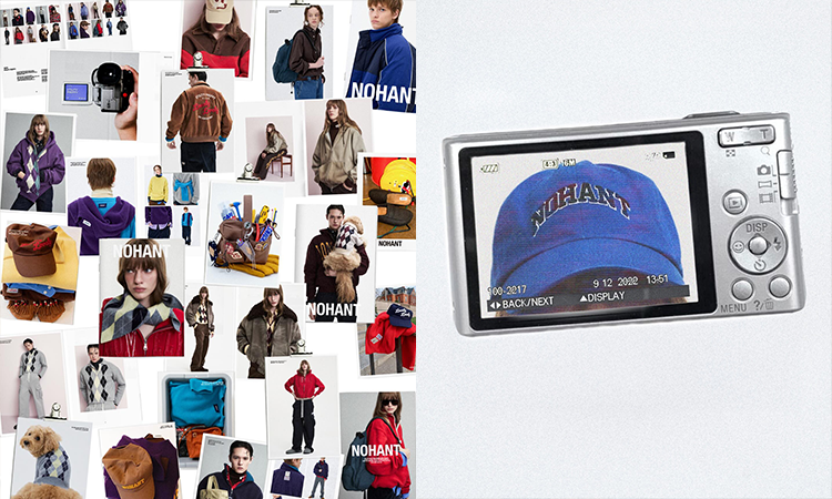
A Distribution Structure Spanning Online and Offline
NOHANT directly operates its Hannam flagship and official online store, while also expanding its consumer touchpoints through external online channels such as Musinsa and 29CM, as well as overseas platforms.
Its own channels showcase the brand's overall mood and collections, while external platforms connect it with a broader customer base.
The fact that it uses both its brand spaces and major online platforms, rather than focusing on a single sales channel, is worth noting when looking at the distribution strategies of Korean designer brands.
Styling That Extends into Lifestyle
NOHANT's sensibility sits close to everyday wear that is polished yet comfortable.
It styles comfortable items like pajama shirts and track setups together with classic outerwear such as jackets and trench coats. This natural mix of casual and classic captures the relaxed mood of the "Brunch Look" that NOHANT talks about.
The fact that its pieces can be worn across various parts of daily life, from work to weekends and travel, rather than being limited to a specific occasion, also increases the versatility of its product assortment.

Typography Design
Another element that strongly imprinted NOHANT's identity on the public is its typography.
"LONELY/LOVELY" has become NOHANT's signature graphic.
Noah Nam explained that he got the idea while hearing people around him say they were "lonely," realizing that changing just one letter turns it into "lovely."
Going beyond simple logo play, it turned a small difference in everyday language into a witty fashion graphic. The graphic continues to be rolled out today across a range of products, including T-shirts and sweatshirts.
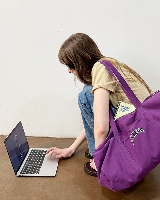
NOHANT's LOVE CITY series is another example of expanding the brand's design language, combining Hangul and English to express city names as new graphics.
Sourcing Insights for Buyers
Using "Seoul" as an Origin and Brand Asset
As with LOVE CITY, it's worth paying attention to the approach of transforming local identity into graphics and designs that overseas consumers can intuitively understand, rather than hiding it. More than simply showing local elements as they are, the ability to translate them into a visual language that consumers from other cultures can understand can become a brand's point of difference.
Using Graphic Products as Entry Items
Rather than selling the brand's entire worldview at once, you can look to a product assortment that uses intuitive products like typography T-shirts and sweatshirts as entry products, then extends interest to ready-to-wear such as outerwear and pants.
Brand Operating Strength Sustained for 14 Years
Unlike trend-driven brands that appear and disappear quickly, the fact that NOHANT has maintained its core design language of the Brunch Look, unisex silhouettes, and typography over the long term is a factor worth considering when judging a brand's staying power during the buying process.
💡 EDITORIAL SMALL TALK
A Sensibility That Began in Paris, a Language Completed in Seoul
NOHANT's starting point was the relaxed, natural "Brunch Look" of Parisians. But what made the brand memorable was Seoul, Hangul, and NOHANT's own way of twisting everyday language, as in LONELY/LOVELY. Instead of simply imitating European aesthetics, it added the language of its own city on top of a sensibility drawn from elsewhere. NOHANT's identity, sustained over 14 years, can ultimately be seen as the product of combining these two sensibilities.